So, I thought it would be cool to show how I make a 2 color linoleum print. First off, it is important to note that I consider myself a "semi-folk printmaker", meaning that although I went to art school and learned all kinds of good stuff, I definitely didn't study printmaking. I've never even read a book on printmaking. So I probably do everything in a way that's different than a "real" printmaker. I've taught myself how to do everything.
For my first 2 color (which was a woodcut), I actually took one piece of wood and cut an area out of it with a saw, so that I could ink one area black and the other area blue. I bet nobody else has done that! (well, maybe not).
Anyway, now I am on this kick where I print one image in white then print black on top of it, and this is all done on colored paper. I just love the effect.
Below is part of the process for making one of my 2 color linocut prints:

First I make a sketch.
Then I draw the sketch on my linoleum and carve away what I don't want.
Next I make a print on paper with my carved linoleum piece.
THEN, (here comes one of my possibly weird techniques), I press the paper while the ink is still wet onto a blank, uncarved piece of linoleum. (You can see the reverse of the tree in the image on the right.)
And last, I use my fresh piece of newly inked linoleum to decide where to carve for my 2nd color. Since I can see where objects in my first piece of linoleum are, I can just easily draw and carve what I want to see in the background and know exactly how it all registers. Amazing!
Maybe all of this will make more sense once I actually make a 2-color print with these pieces of linoleum. Coming soon!

 My musical tastes have certainly toned down and moved to something a little more subtle and my design aesthetic has as well. Take for example this cabinet, which my dad and I made when I was in highschool (before any of those design classes!). While I still just love those X cut-outs and textured acrylic panels inside, that crackle finish was killing me! I had actually never used paint stripper before this project, and boy is it toxic! Anyway, I decided to strip that mess off this cabinet. And duh, change out those overbearing pulls. AND add some casters because I've been thinking this cabinet needed legs for a long time.
 (Excuse the top cabinet doors not quite lining up) I love the result! It definitely feels more mellow and understated... And surprise, you actually can appreciate those cool cut-outs now!
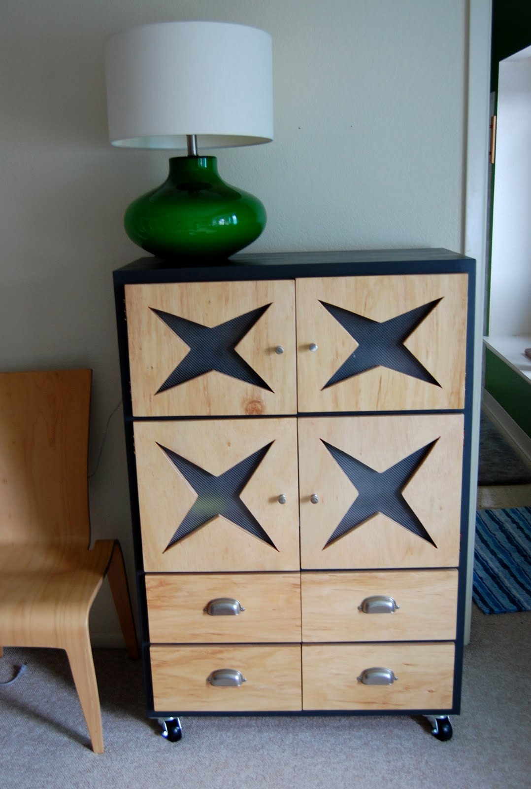 After going to design school, now I would never cover my form with something so distracting to it as that crackle finish. I think crackle finish has a place, just maybe not in my house anymore!
 I don't know... Maybe this cabinet has become more Wilco?