Tuesday, October 11, 2011

Octopus Love Search

The Octopus Ink gallery here in Anchorage just celebrated its two-year anniversary, and to celebrate all of us artist folks created octopus themed work. I knew I wanted a patterned background and I always love a good honeycomb pattern, so that part was easy. I had a hard time deciding what the octopus should be doing. Originally I had this idea of the octopus yelling something ala Russian Constructivism, like this:
Which would be super cool, but the triangular "yell" shape somehow made me think of the light of a flashlight, which obviously needs to be shining on something... and well, you see where it ended up. I really love Russian Constructivist graphic design, but this octopus print is clearly not it! Another print, perhaps!
Anyway, I love the yellow/gold paper. And I can't get enough of printing with white ink. And I also kind of love that the eyes of the octopus look a bit insane.

Friday, September 30, 2011

Cranium, Moth linocut print

I finished this almost a month ago. I've had a hankerin' to work on some work that is a bit more... random. And I'd say that this print certainly does the trick. I started with wanting to make a chevron pattern for a background (and to print on fabric eventually). Then, I'm sort of obsessed with phrenology heads and bug illustrations, and well, it just happened.
I printed maybe 5 or 6 like this, but I think next I'll keep the paper and the ink of the chevron pattern in similar shades so that they aren't so high contrast.

Monday, August 8, 2011

finished pallet headboard

My pallet headboard has been finished for a while now but I've been waiting to get some good pictures of it before I posted it... I don't really qualify these fisheye photos as good ones, but I just never can resist a good fisheye!
Anyway, it is finished and hung up. It took me a while to decide whether to mount it to my bedframe or the wall, but I finally decided on the wall.

Monday, June 20, 2011

Where the caged goose quacks

My newest print is a tribute to our dear friend, the quacking goose. I just love a good birdcage, and every bird looks a tiny bit cuter in a cage, even if it isn't the ideal living condition for a flying critter. Lets just say that this goose was bad (he hissed and snapped at some little kids), so he is spending some time to think about his actions in this pretty cage.
I'm trying to incorporate a bit more solid inked areas in my prints. I know I have a tendancy to just carve, carve, carve and my prints turn out too white for my tastes. I really had to stop myself from carving more on this one.
This one with white ink on charcoal/navy paper is my first and probably favorite print with this block. I just love white ink, and I'm so excited about colored paper all of a sudden. I always prefer a white matte, so any of these with a white matte become a million times more dynamic than a print on white paper.
This one is for the little girl goose lovers out there. You know who you are.

Thursday, June 16, 2011

Ahoy!

Ahoy mateys! This is my newest print. The name was so last minute, and it somehow makes me like the print a million times more. It can be fun to make little prints (this one is 5" x 7"ish) that aren't too serious and involved. And, I sell tons more small ones than I do large ones... So, I've got to give the people what they want (within reason, of course)!
Here it is scanned in, looking totally different for some reason.
Another new print is on the way. I just finished carving it but I haven't printed it yet. It involves a goose and a cage, so its bound to be amazing! I'm predicting lots of geese in the future of my prints. They are just so loud and goofy, especially when hissing.

Saturday, June 4, 2011

where things begin


Last night I had a show at the Octopus Ink Gallery in downtown Anchorage. We took a few iPhone photos of the crowd:


I sent some photos of my prints to the Anchorage Press and hooray! they put one in the paper.

Saturday, May 14, 2011

Caught & Free linocut prints

Last week I finished some new linocut prints. I wanted to make some larger-scale salmon (other salmon in prints I've made have been small-ish) and I thought salmon in a next would be fun.
Here is my initial sketch.
The carving process.
The carving, all finished.
Without the net- I'm calling this one "Free".
And "Caught". I like the print with and without the net, so I think I'll be printing some of each and seeing which people buy more of.

Saturday, April 2, 2011

Anchorage From Above

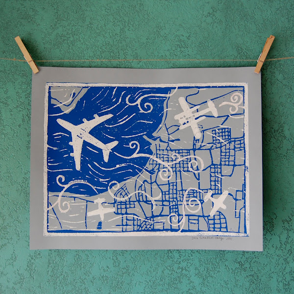
Here is the print I made for the People Mover First Friday show. The bus was parked on G Street and had transportation-themed art inside it, and people walked through it and voted for their favorite. I don't know who won yet but I'm guessing maybe not mine since it didn't have anything bus-related in it and there were some entries that did. But we'll see.

I also made some other color variations of this print. I really do like the light blue with deep blue on top, but this light blue looks funky since I put blue ink over my linoleum that still was covered with white ink.

Thursday, March 24, 2011

new linocut peek

I'm working on a few linocut print for a transportation themed show next Friday, that happens to be taking place in a bus! It is going to be 2 colors and this is just the bottom image- a map of Anchorage. The top image should really make things dynamic.
This turquoise wall is my print-drying spot.

Saturday, March 19, 2011

revamped chairs!

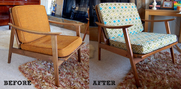
I can't take credit for this awesome upholstery work, but I did pick the fabric! I lived with those orange cushions for 3 years, and I'm quite sure that they were original to the chairs. Through work I have access to every fabric manufacturer known to man, and I felt like I searched through all of them... I narrowed my choices down to 4 and finally decided to go with this one- the brightest and loudest of them all.
I was a little bit afraid to see the finished products because I thought they might be too much. I'm sure they would be too much for some people, but I think they are just perfect! I think the fabric perfectly compliments the chair design.
Something is going to happen to that coffee table, and soon. I'm thinking that I'll paint the base yellow and refinish the top, maybe walnut? Though, I dream of a rustic round coffee table with turned legs, you know, so my house doesn't look exclusively 50s-60s modern.
I designed the X lamp in the background. Can you find the cat butt in this picture?

Thursday, March 17, 2011

from Marilyn Manson to... Iron and Wine?

My musical tastes have certainly toned down and moved to something a little more subtle and my design aesthetic has as well. Take for example this cabinet, which my dad and I made when I was in highschool (before any of those design classes!). While I still just love those X cut-outs and textured acrylic panels inside, that crackle finish was killing me! I had actually never used paint stripper before this project, and boy is it toxic! Anyway, I decided to strip that mess off this cabinet. And duh, change out those overbearing pulls. AND add some casters because I've been thinking this cabinet needed legs for a long time.
(Excuse the top cabinet doors not quite lining up) I love the result! It definitely feels more mellow and understated... And surprise, you actually can appreciate those cool cut-outs now!
After going to design school, now I would never cover my form with something so distracting to it as that crackle finish. I think crackle finish has a place, just maybe not in my house anymore!
I don't know... Maybe this cabinet has become more Wilco?

Thursday, March 10, 2011

paint stripping

I've been working on stripping the paint off of the first piece of furniture I ever made (my dad helped). I made it in highschool when my taste was very black with neon and Marilyn Manson, ha. Black and red crackle paint totally doesn't go with my style anymore! (The above photo shows globs of paint stripper on the side of the cabinet.)

I can't believe that this pretty wood has been under all of that paint all of those years! All of the drawers and doors will be natural, and I think I will paint the cabinet body charcoal gray. And I'll be adding casters to the bottom of the cabinet, and of course new pulls.

Sunday, February 13, 2011

Sunrise, Sunset

Here is my newest 2-color linocut print. Your eyes aren't playing tricks on you, the prints above and below are on different colored paper.
This is a smaller print for me, at about 8" x 10". This size was so manageable compared to some I've done in the past. I'll probably try to make a few more that are this size so that they'll look nice framed together. I'm thinking something with a cat will be next...

Thursday, February 10, 2011

2 color print process

So, I thought it would be cool to show how I make a 2 color linoleum print. First off, it is important to note that I consider myself a "semi-folk printmaker", meaning that although I went to art school and learned all kinds of good stuff, I definitely didn't study printmaking. I've never even read a book on printmaking. So I probably do everything in a way that's different than a "real" printmaker. I've taught myself how to do everything.

For my first 2 color (which was a woodcut), I actually took one piece of wood and cut an area out of it with a saw, so that I could ink one area black and the other area blue. I bet nobody else has done that! (well, maybe not).

Anyway, now I am on this kick where I print one image in white then print black on top of it, and this is all done on colored paper. I just love the effect.

Below is part of the process for making one of my 2 color linocut prints:

First I make a sketch.
Then I draw the sketch on my linoleum and carve away what I don't want.
Next I make a print on paper with my carved linoleum piece.
THEN, (here comes one of my possibly weird techniques), I press the paper while the ink is still wet onto a blank, uncarved piece of linoleum. (You can see the reverse of the tree in the image on the right.)
And last, I use my fresh piece of newly inked linoleum to decide where to carve for my 2nd color. Since I can see where objects in my first piece of linoleum are, I can just easily draw and carve what I want to see in the background and know exactly how it all registers. Amazing!

Maybe all of this will make more sense once I actually make a 2-color print with these pieces of linoleum. Coming soon!