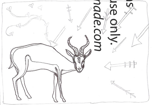
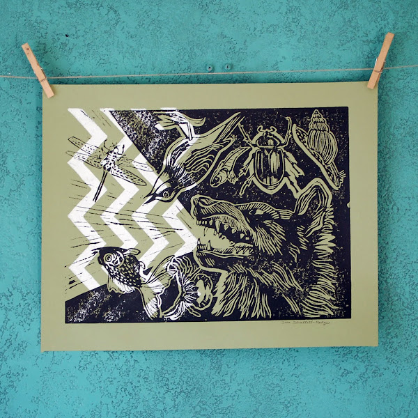
So, this print had to be influenced by Apocalypto in some way. I had been doodling arrows before watching the movie, and I was flipping through my animal illustration book, and then while watching the movie, this print idea developed. I love kudus and springboks, and it was far time to make a print of one of them.
After establishing the springbok/arrow theme, I liked the idea of the springbok somehow "loving" even though he was being killed. So, it turned out that his love/soul escaped through the arrow shot.
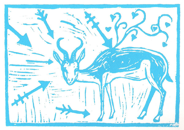
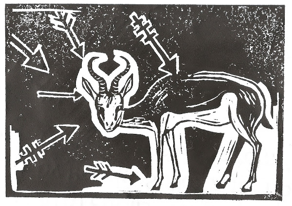
Obviously the first photo here was my initial sketch (on used paper, of course), then a test print to see how things were looking, then a print in blue ink to work on registration with the background pattern.

I am happy with this print. It happened much more quickly than usual, too, which is a plus. I used to not think about prints so much, and they turned out (debate-ably) better. I think the background print is interesting enough to.... provide interest, while not stealing the show.. which is exactly how it should be, at least in this case.
Whats next? I've got a wolf growl image that must become a print one way or another! Onward, ho!
.jpg)
.jpg)
.jpg)
.jpg)


 So, this print had to be influenced by Apocalypto in some way. I had been doodling arrows before watching the movie, and I was flipping through my animal illustration book, and then while watching the movie, this print idea developed. I love kudus and springboks, and it was far time to make a print of one of them.
 After establishing the springbok/arrow theme, I liked the idea of the springbok somehow "loving" even though he was being killed. So, it turned out that his love/soul escaped through the arrow shot.
 Finally, a new print! I really like the amount of solid black, solid white, and lines in this one. To me, it feels really balanced as far as that goes. I also like the Northern Lights/acid rain effect of the lines in the sky. I debated on making this a 2-color print, because I almost feel like I'm cheating when I use only one color these days, but I think this works in just black ink.
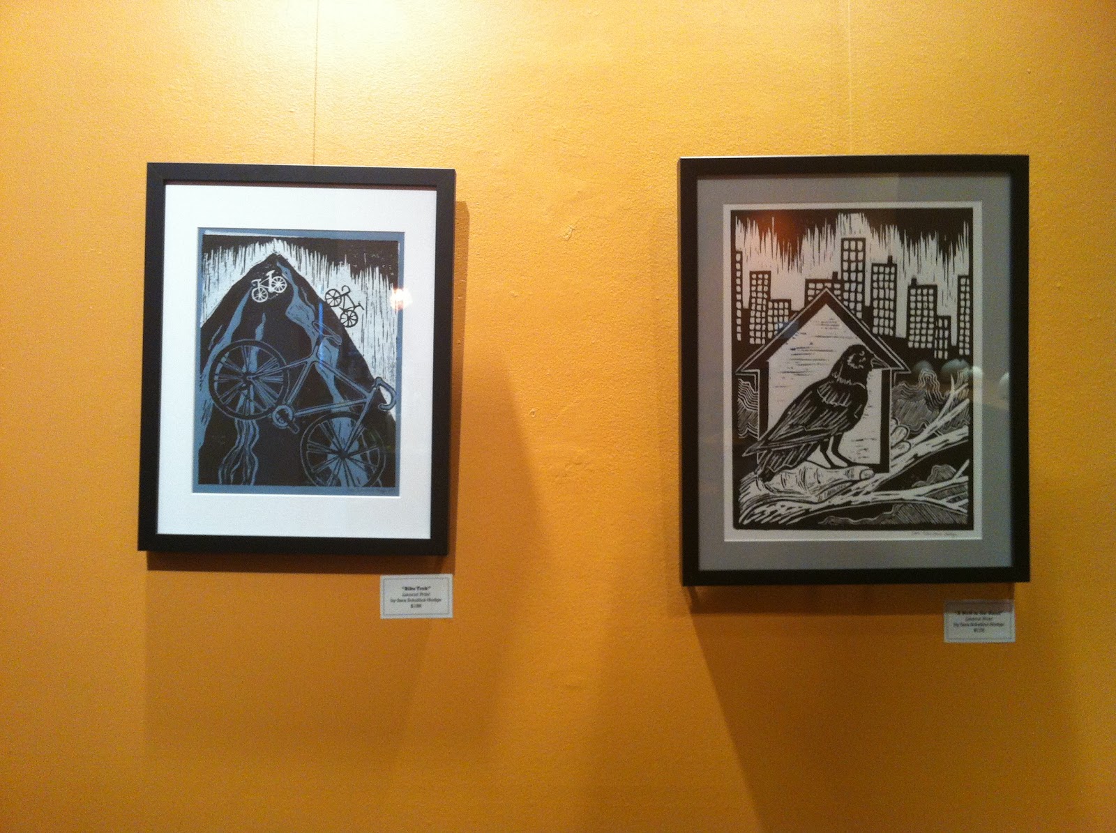
 A good pal of mine has a somewhat new daughter named Raven and she said I should make a raven print, so I did. The ravens in Alaska are GIGANTIC and hop around on their GIANT feet like maniacs and open garbage bags just to spread the garbage in the road, so I thought they seemed worthy of my making a print of one of them.
 I seem to be incapable of taking good photos of my prints, ack!
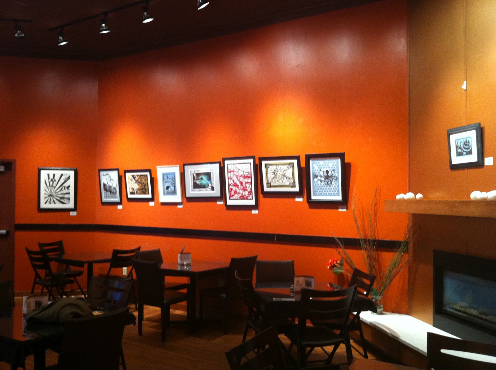